Product guide
A Link in bio page that doesn't look like everyone else's
Most link in bio pages are the same stack of grey buttons. Here's how to make yours look like your brand, put the right link first and see what people tap. Free, with no plan needed.

Founder and CEO, Wahlu
· 3 min read
Tap the link in a dozen Instagram or TikTok bios and you'll see the same page a dozen times: a round photo, a name, and a stack of identical buttons. It works, but it doesn't tell anyone who you are.
Your link in bio page is often the first thing people see after your profile. It's worth five minutes to make it look like yours. This guide shows how, using Wahlu's Link in bio, which is free and needs no plan. The ideas apply to any link in bio tool.
Start with the right link first
Before colours and fonts, decide what the page is for. Most people tap one link and leave, so the first link matters more than the other nine.
Ask: what's the one thing someone should do after seeing my profile? Book a table, order for pick-up, buy the new print, listen to the latest episode. That's your first link.
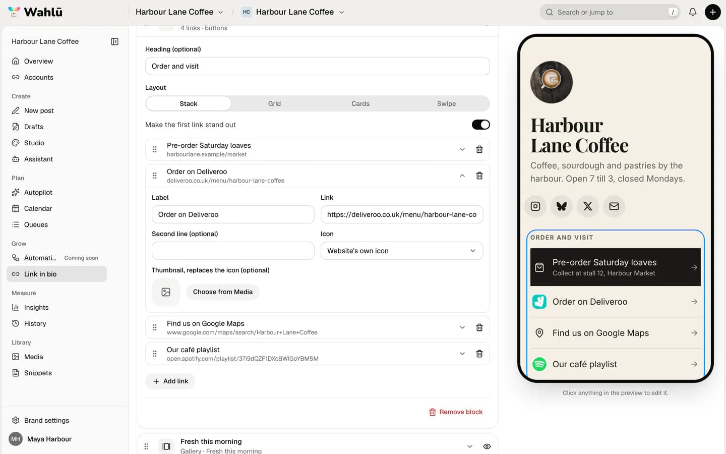
In Wahlu, open the Links block, set to Stack or Grid, and turn on Make the first link stand out. The first link gets bigger, or spans the full width if your links are in a grid, so it reads as the main thing to tap.
Then keep the rest short. Three to six links is plenty. If a link hasn't been tapped in a month (more on stats below), take it off.
Pick a theme, then make it yours
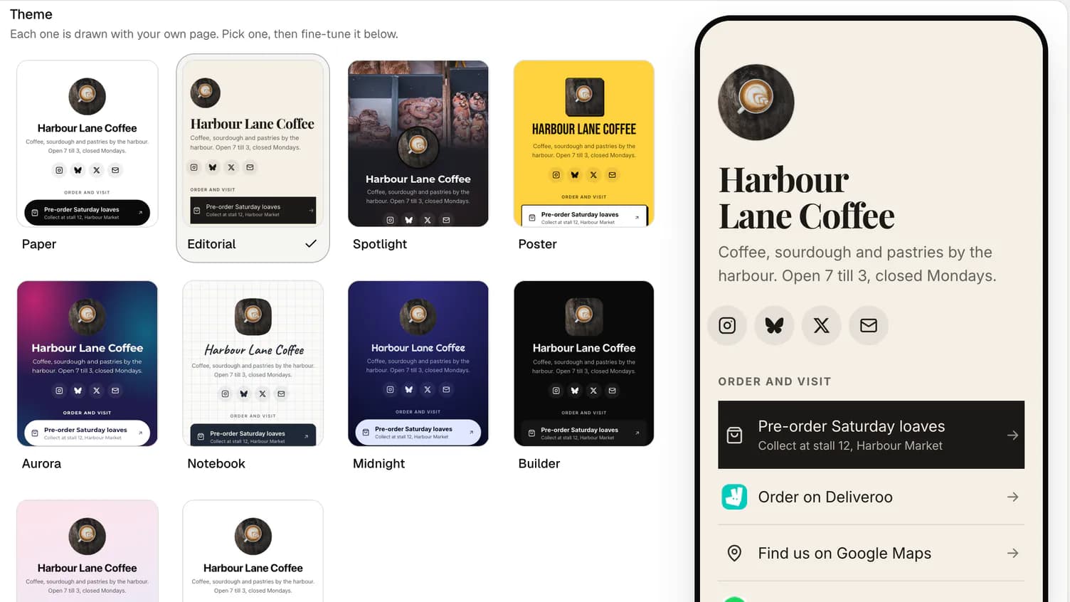
Open the Design tab and look under Theme. There are ten: Paper, Editorial, Spotlight, Poster, Aurora, Notebook, Midnight, Builder, Sorbet and Brand. Each one is drawn with your own page, your photo, name and links, so you see the real result rather than a stock example.
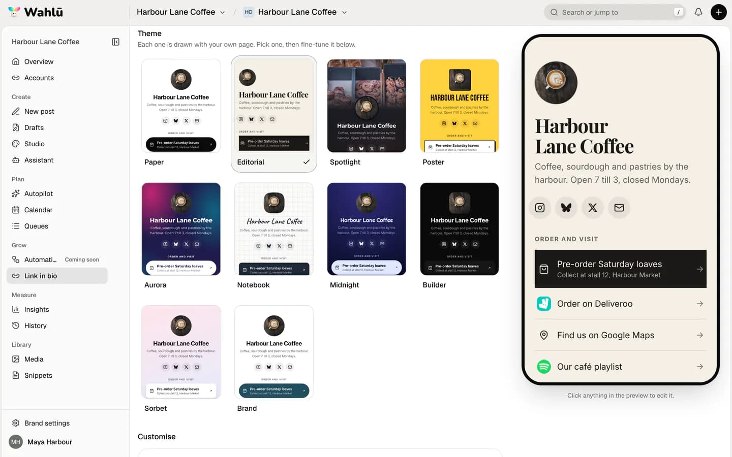
A theme is a starting point. Under Customise you can change every part of it:
- Background: a colour, a gradient, a pattern (dots, grid or lines) or a picture with a tint. A photo of your shop, studio or product does more than any colour.
- Text: the font for your words and a second font for your name and headings. A serif heading with a clean body font reads as calm and considered; a bold sans serif reads as confident.
- Header: centred, left, or a full-width cover picture that fades into the background.
- Buttons: solid, outline, soft shadow, hard shadow, frosted glass, tinted or plain rows, with your own corners and colours.
If you choose a colour that would be hard to read, the page adjusts it so people can still read your links, and the Design tab tells you it did.
A good rule: pick one colour from your logo or shop front, use it for the buttons, and leave everything else quiet.
Let websites bring their own logos
A row of buttons that all look the same is hard to scan. Give each link an icon so people find the right one at a glance.
Open a link and set Icon to Website's own icon. Your page then shows that site's logo beside the link: your booking system, your shop, your podcast host. New links start with it switched on.
For your social profiles, add a Social icons block and click Fill from connected accounts. Wahlu adds the accounts you've already connected. You can add others by hand too, including Bluesky, Pinterest, Spotify, Substack and WhatsApp.
Add more than links
A page of only buttons is a menu. A few other blocks make it feel like a place:
- Gallery: up to 12 photos, as a grid or a row people swipe. Good for this week's specials or recent work.
- Recent posts: a grid of posts you published with Wahlu, so the page stays fresh without you touching it.
- YouTube, Spotify or TikTok: play a video, song or podcast right on the page.
- Text: a heading or a line of opening hours.
- Email or phone: let people get in touch in one tap.
Every picture needs a short description for people using screen readers. You can save a draft without one, but the page won't publish until each picture has one.
Two pages, same café
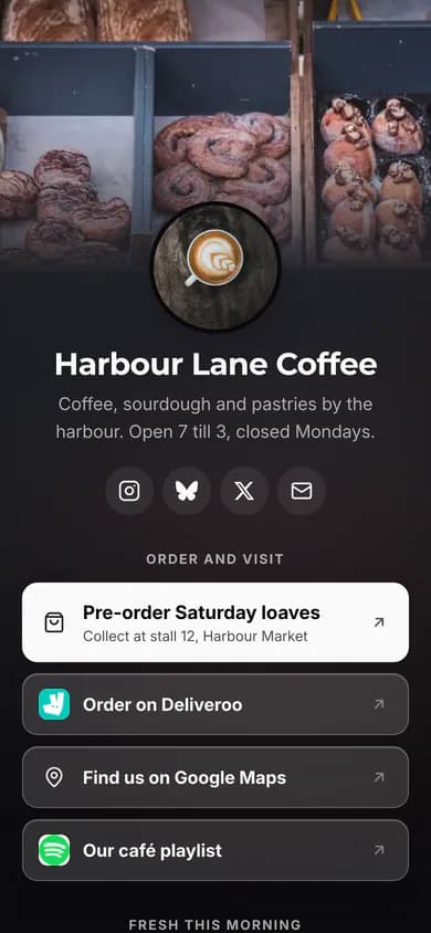
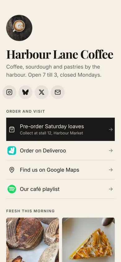
Here's the same example café in two themes. Nothing changed but the theme and a background picture.
See what people tap
The Stats tab shows views, visitors and clicks on each link over the last 7 or 28 days. Counting uses no cookies and leaves out bots and link previews, so the numbers are people.
Once a month:
- Check which link gets the most clicks. If it isn't your first link, consider swapping them.
- Remove links with no clicks.
- Change the first link when your focus changes: a new menu, an event, a launch.
Get your page
- Sign in to Wahlu and open Link in bio under Grow in your brand's menu.
- Pick a handle. Your page lives at
wahlu.me/yourhandle. - Add your links, pick a theme and click Publish changes.
- Copy the link into your Instagram, TikTok, X and Bluesky bios.
Each brand has one page. Pages live on wahlu.me; custom domains aren't available. A small Made with Wahlu link sits at the bottom on every plan.
The Link in bio feature page has the full list of blocks, and the help centre covers setting up your page, design and views and clicks.